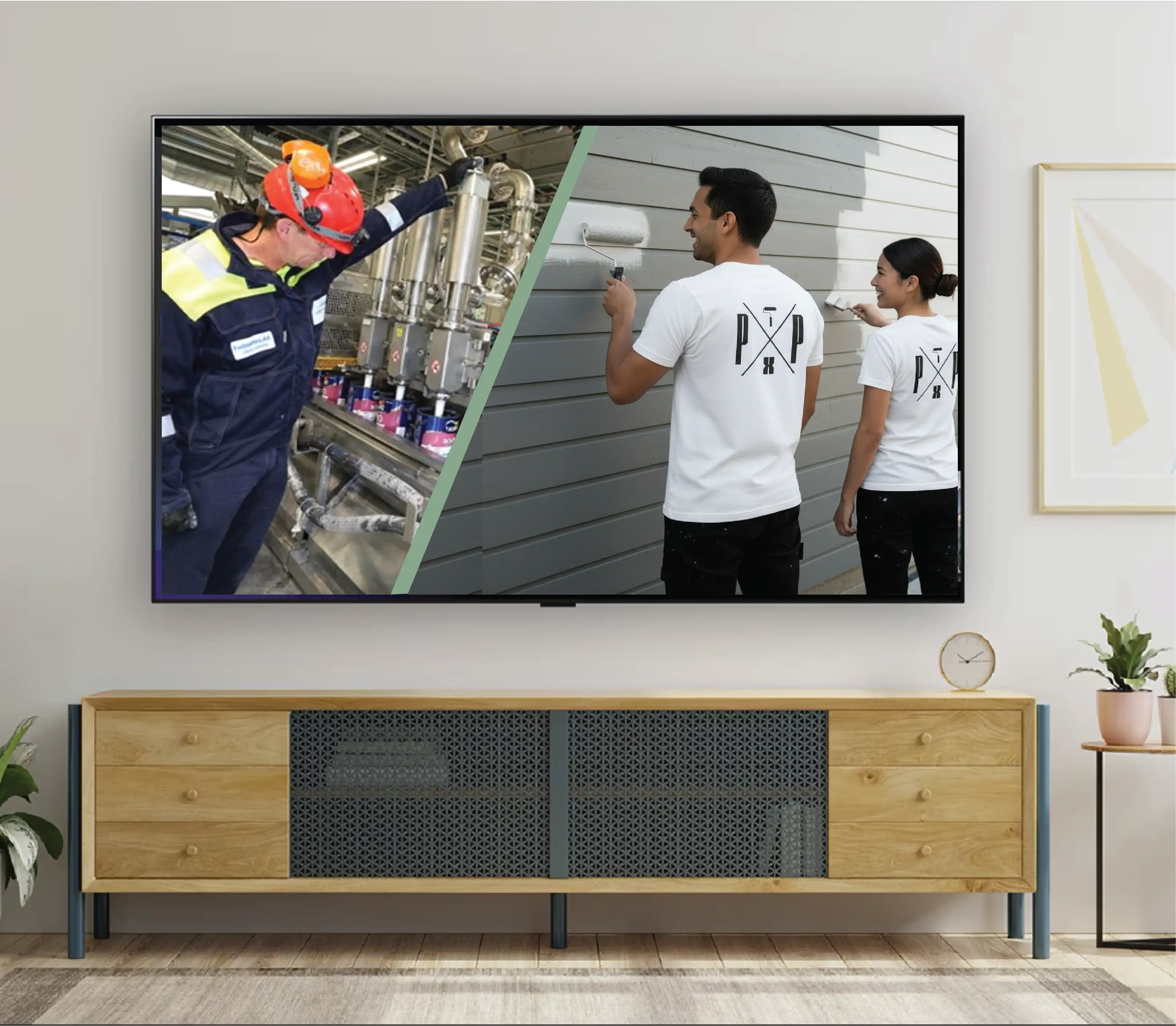
1. Create an eco freindly paint company to appeal to a wide audience such as home DIYers, and contractor, which can rival with recgonizable brands already seen at your local hardware chain.
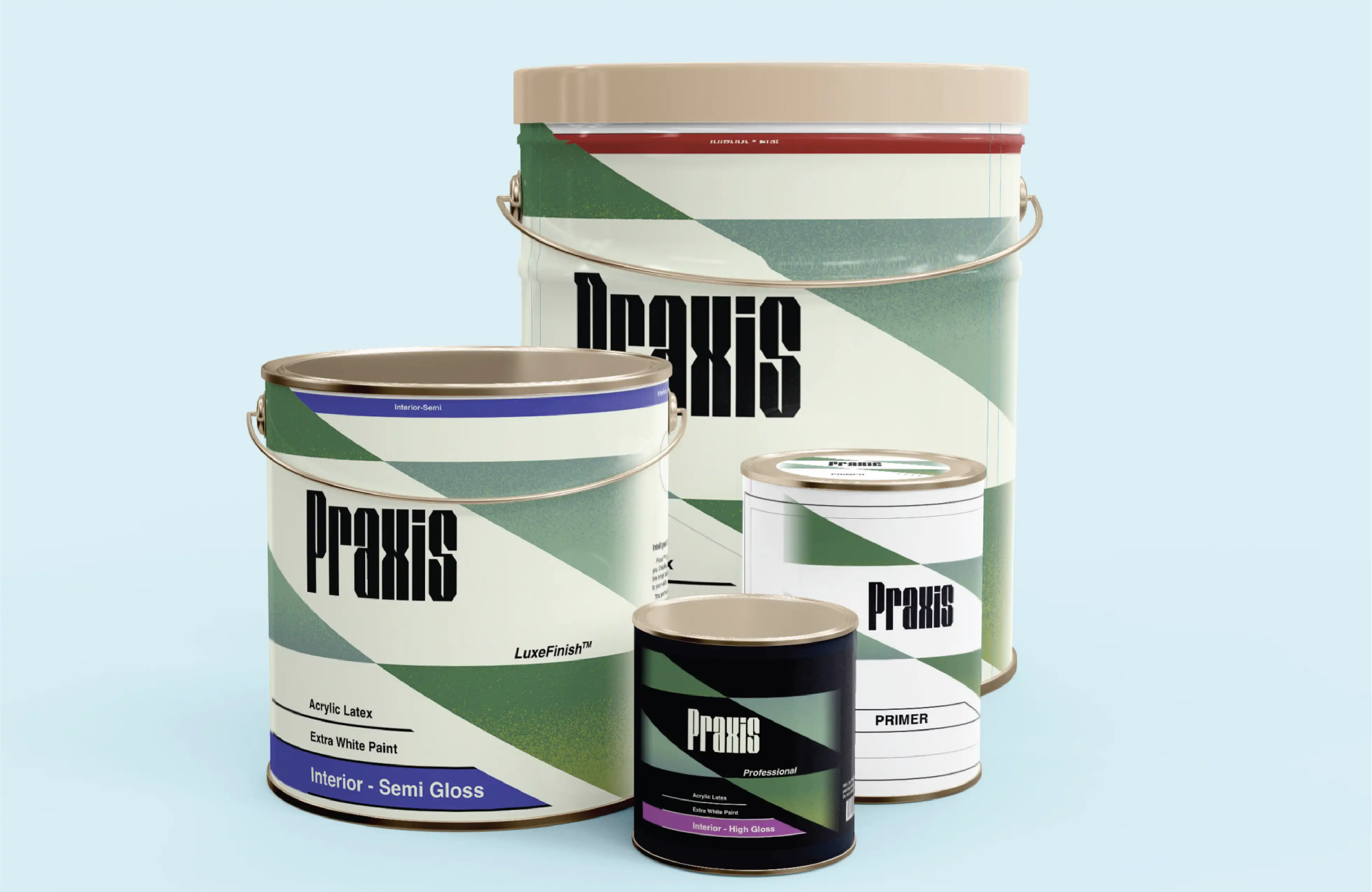
2. Develop 3 designs for cans of varying sizes
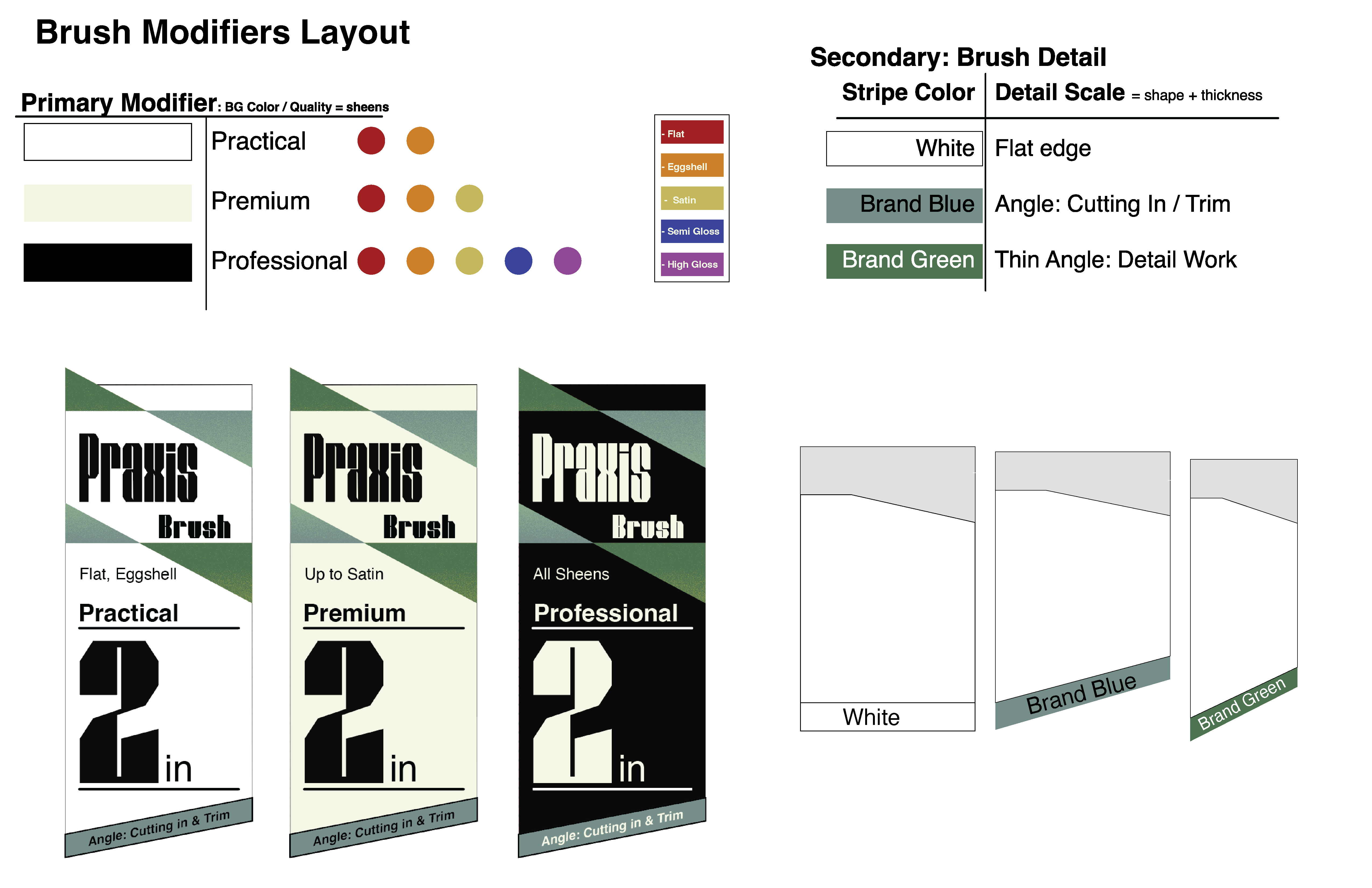
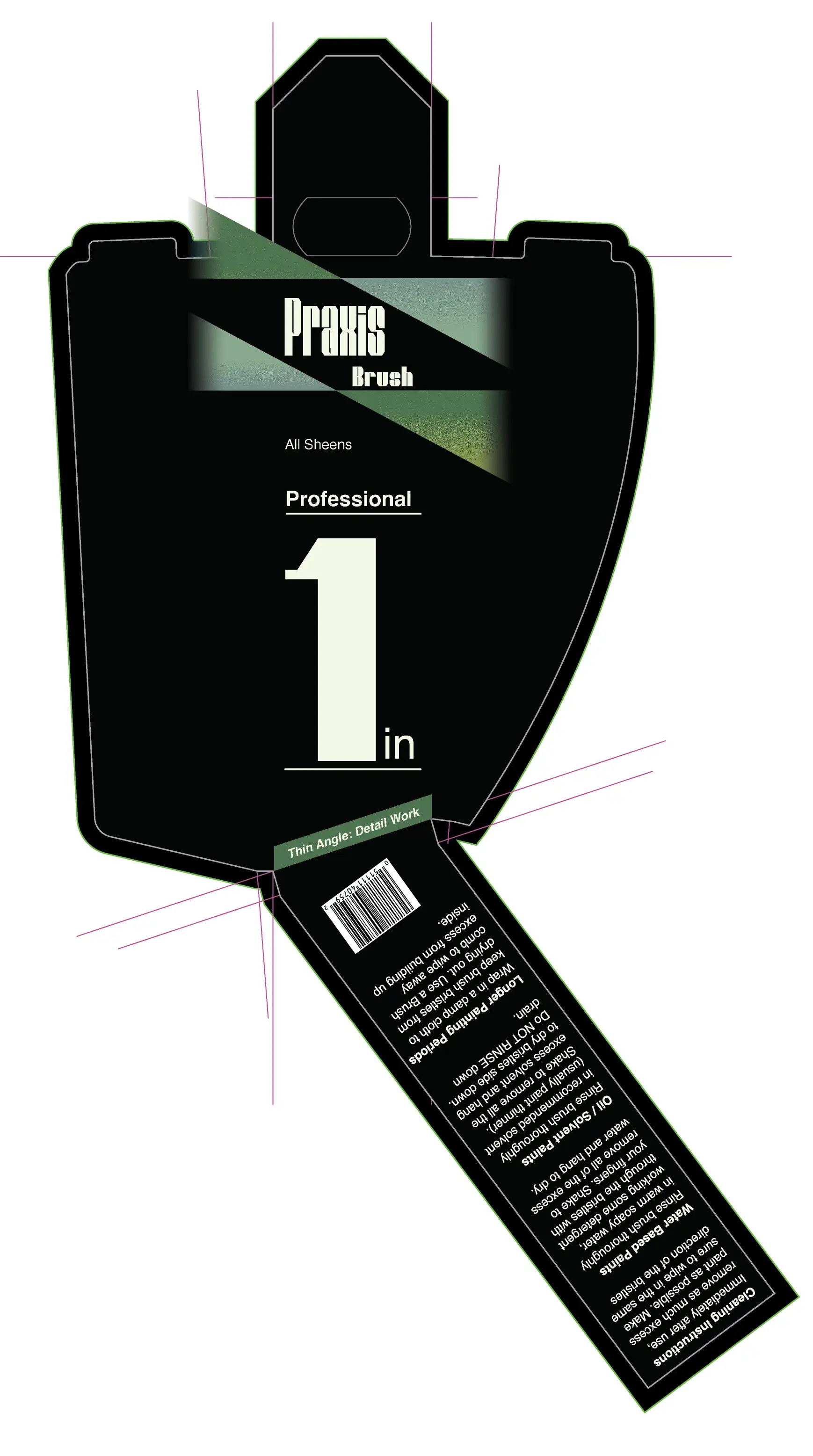
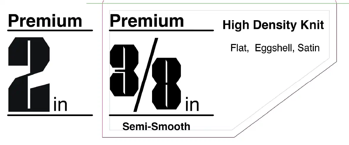
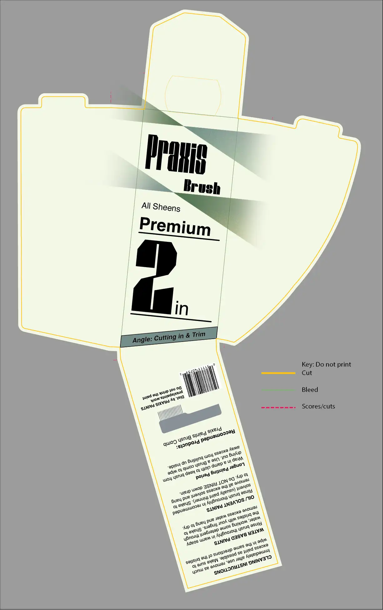
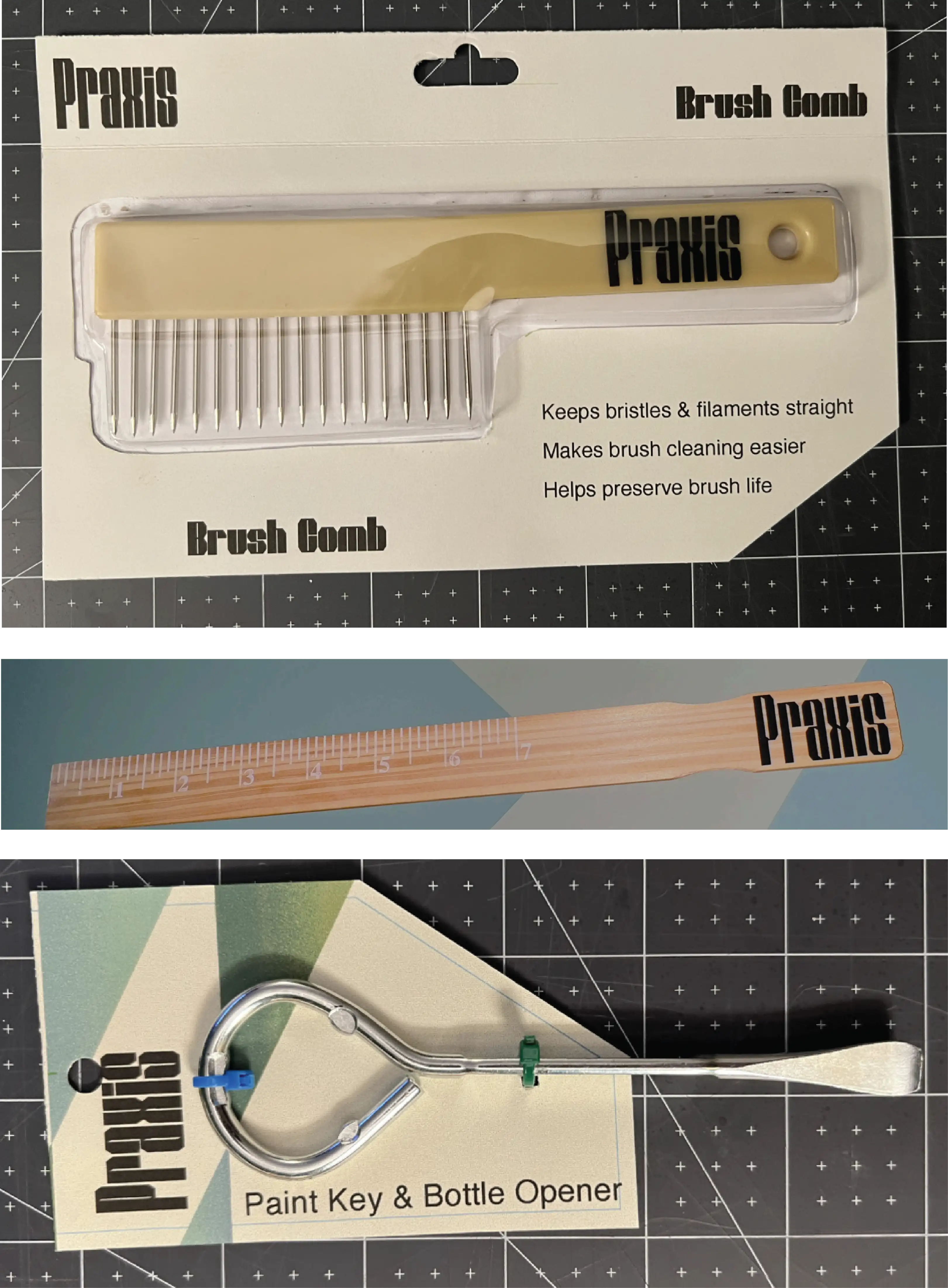
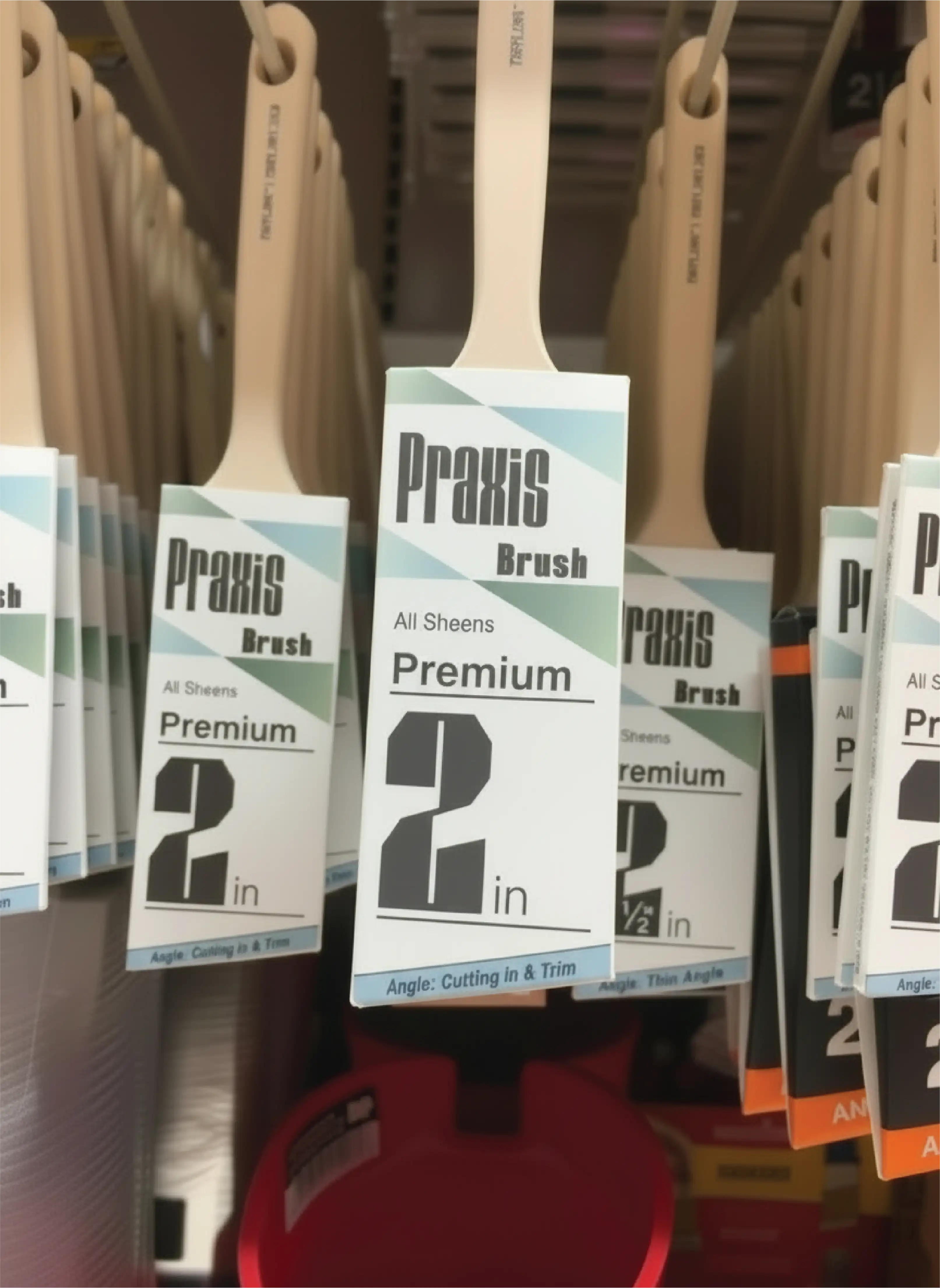
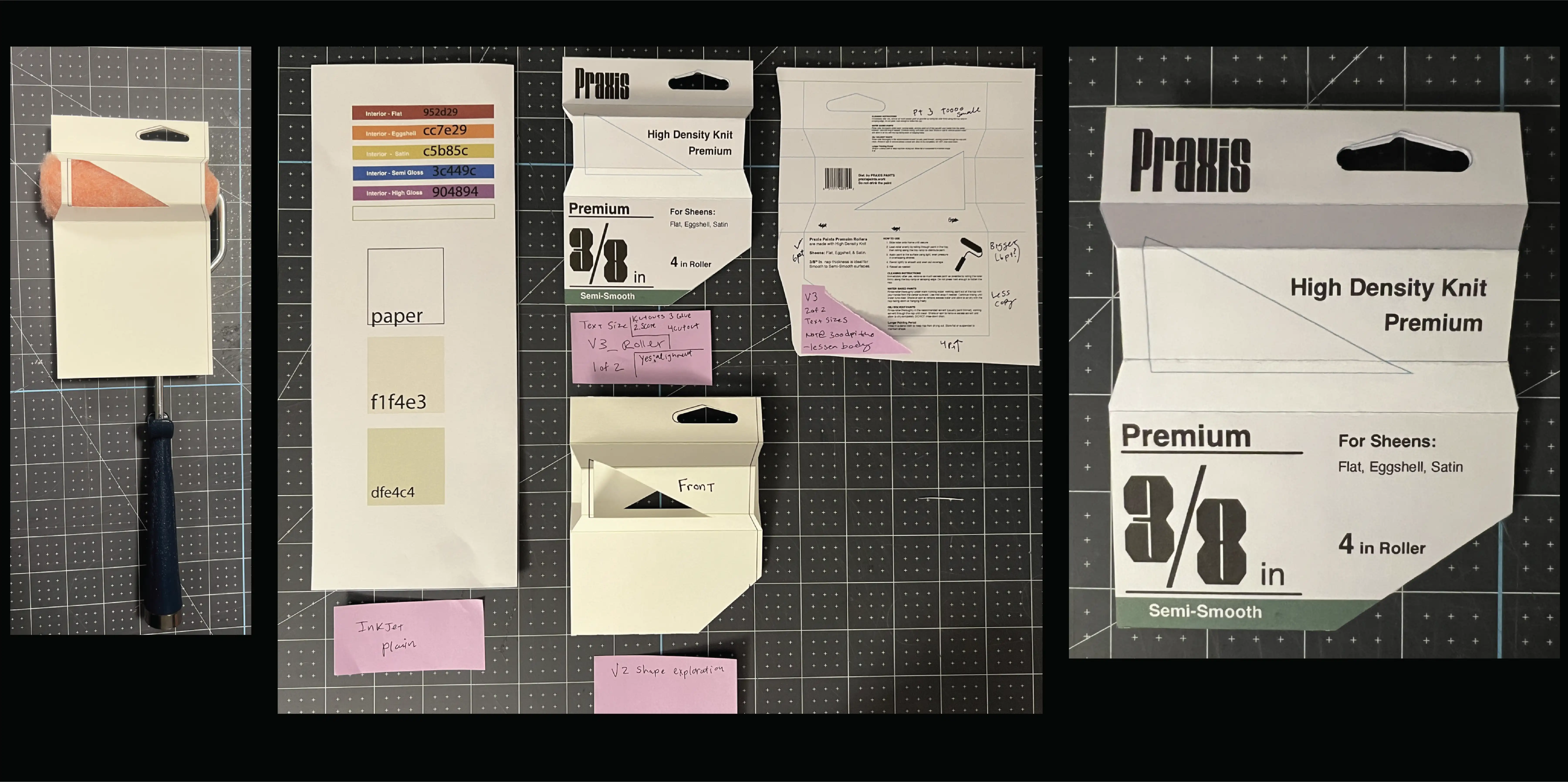
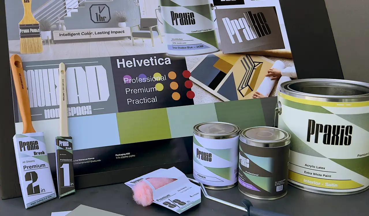
3. Establish a design system for tools sold by the company, with each of their packaging designs printed and assembled.
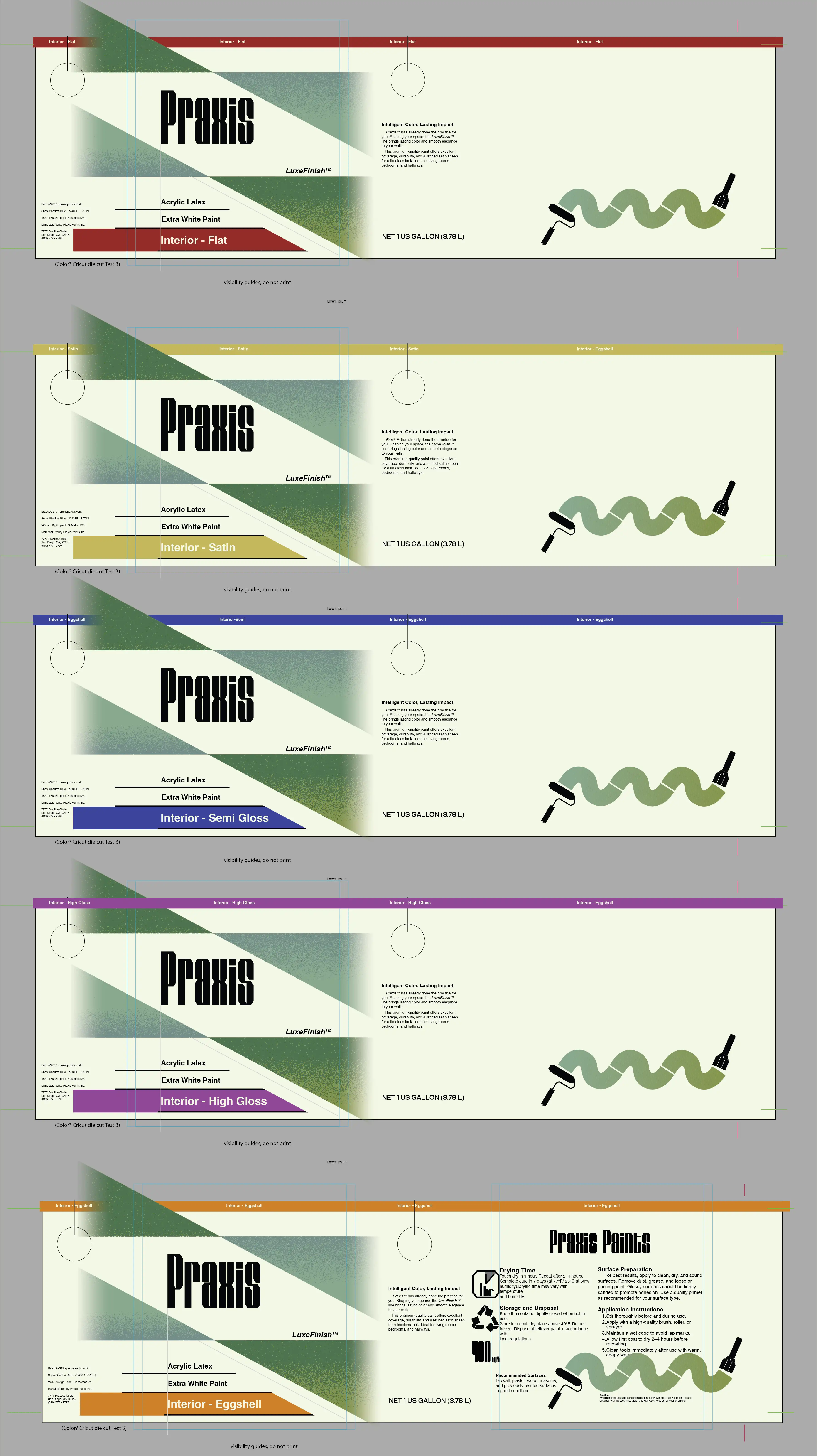
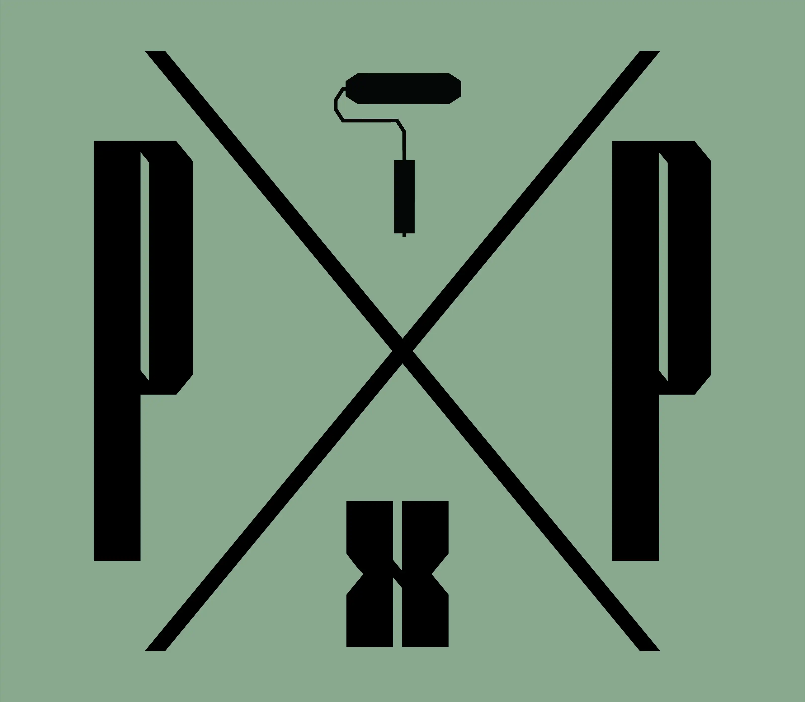
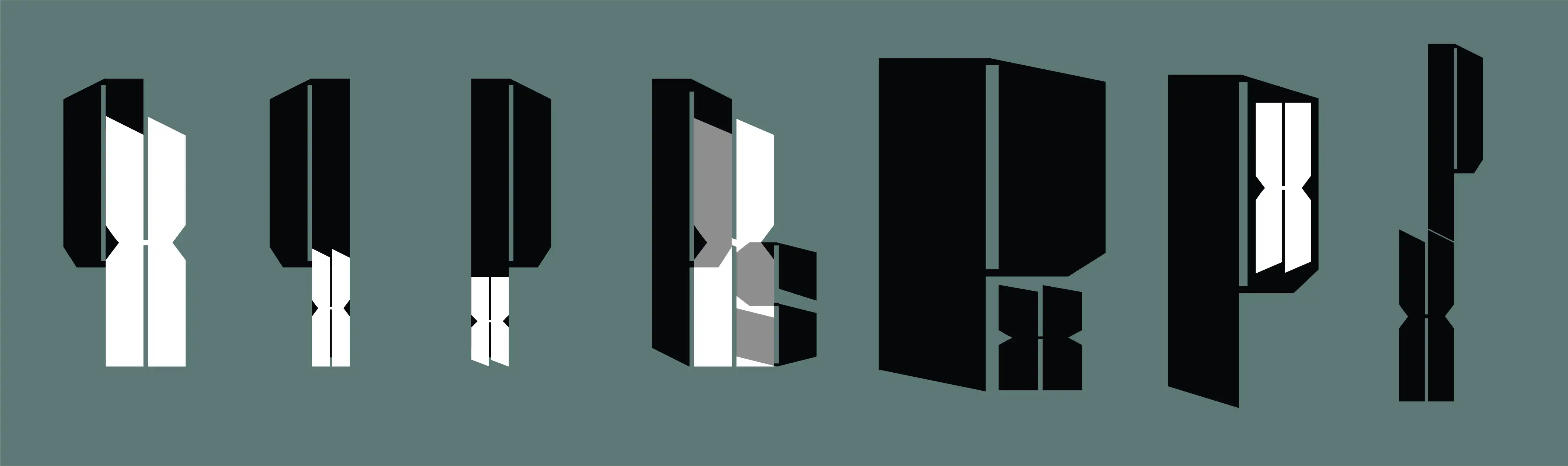
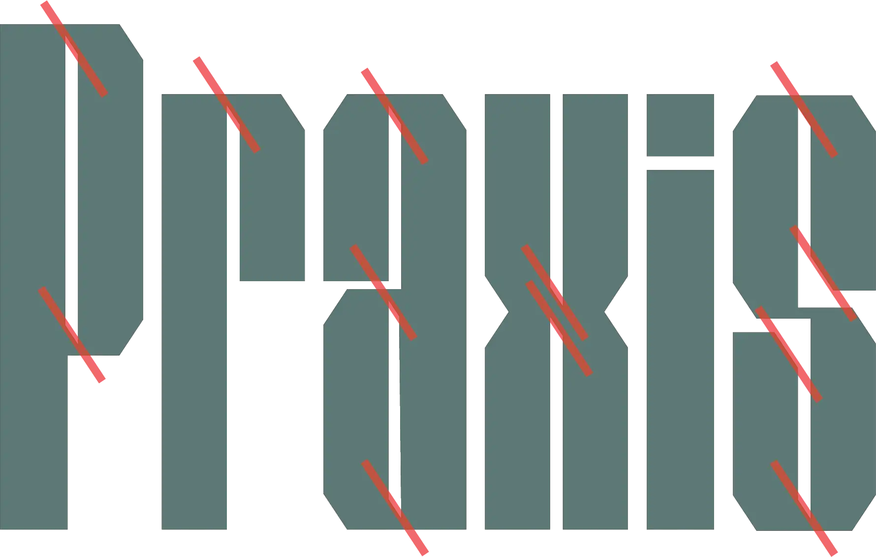
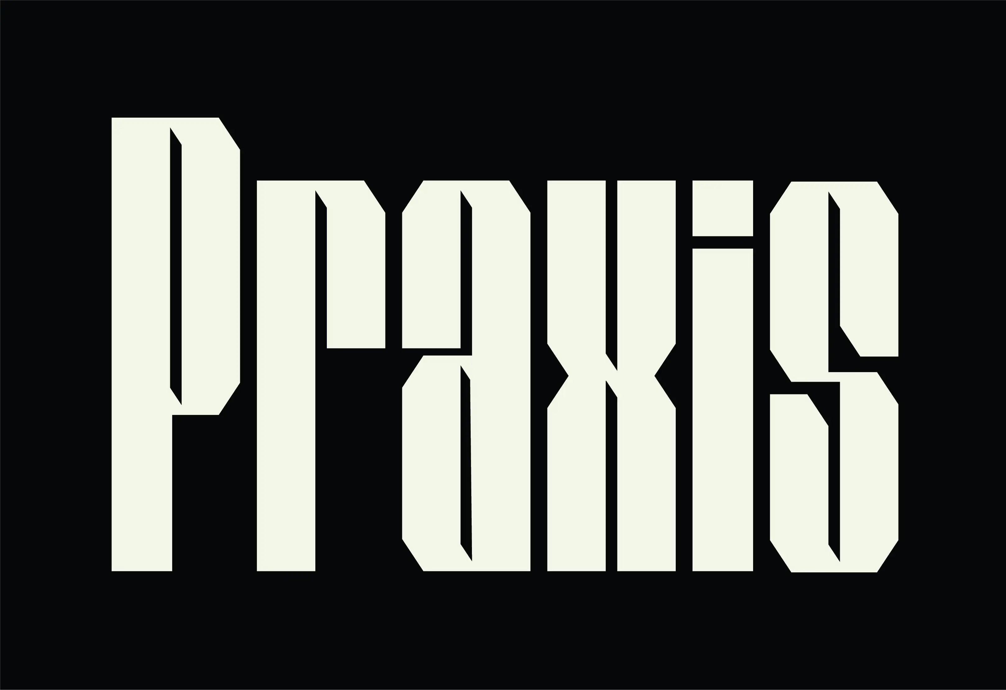
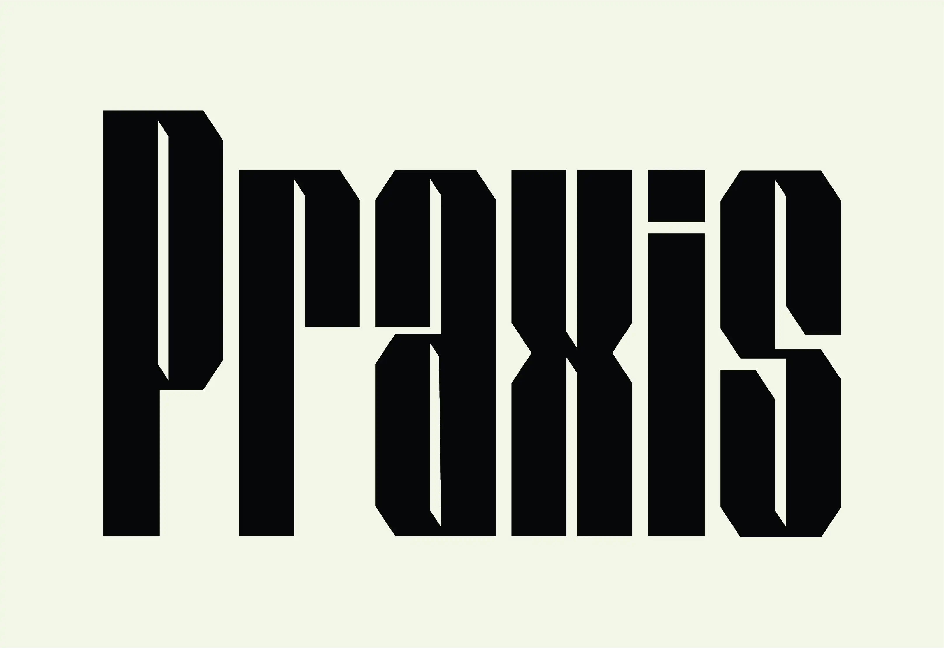
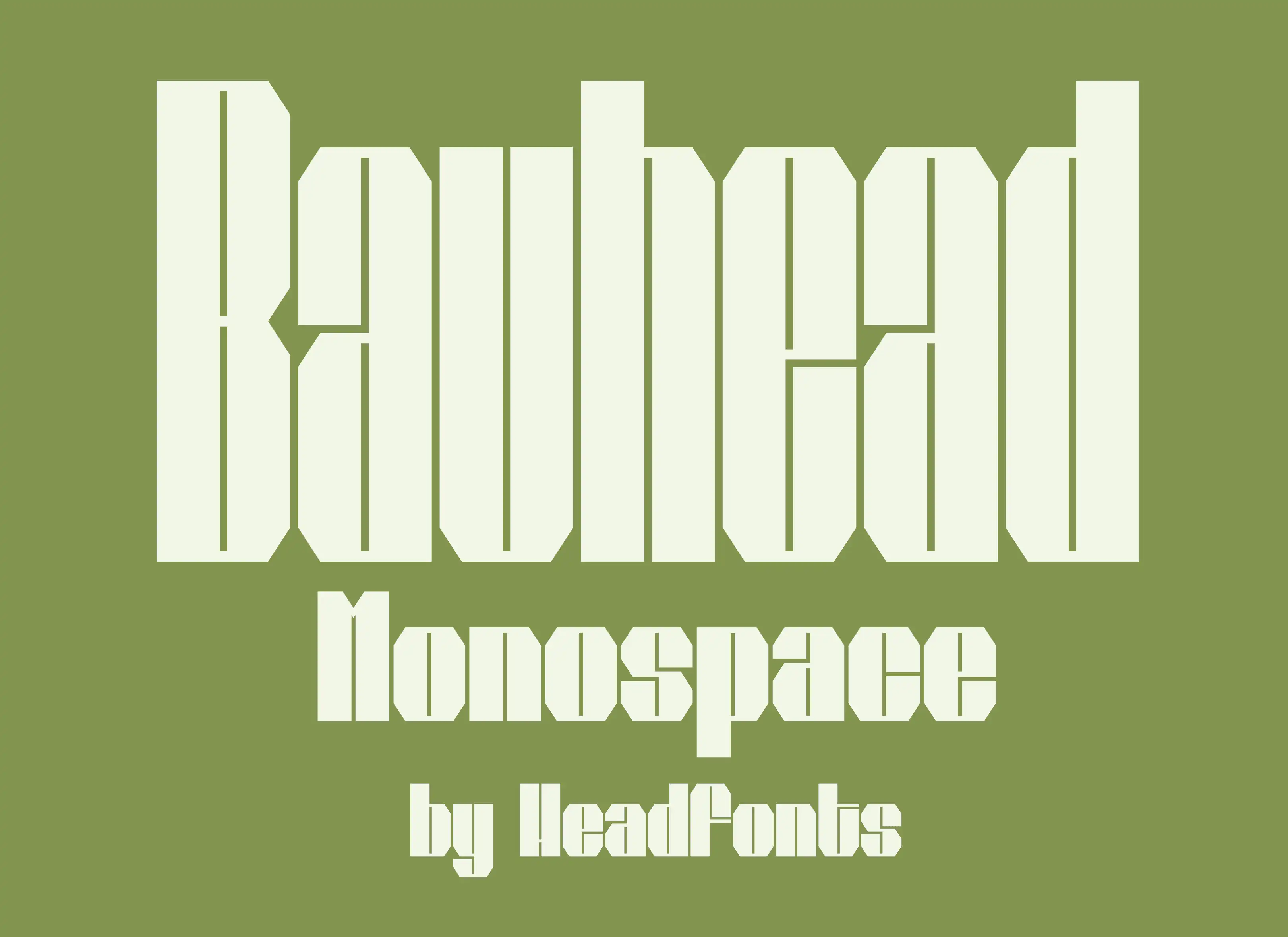
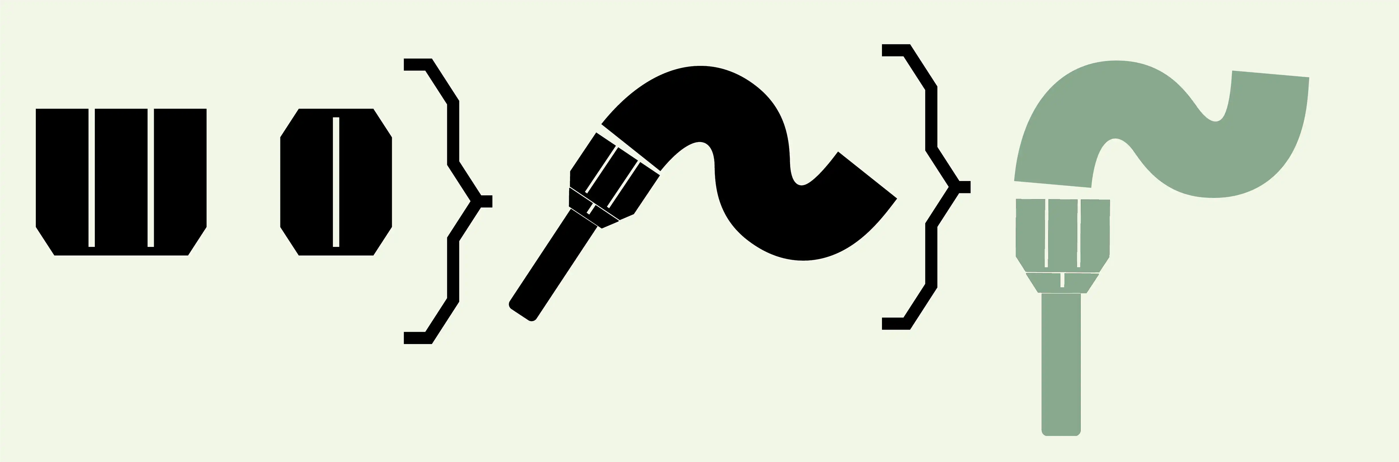
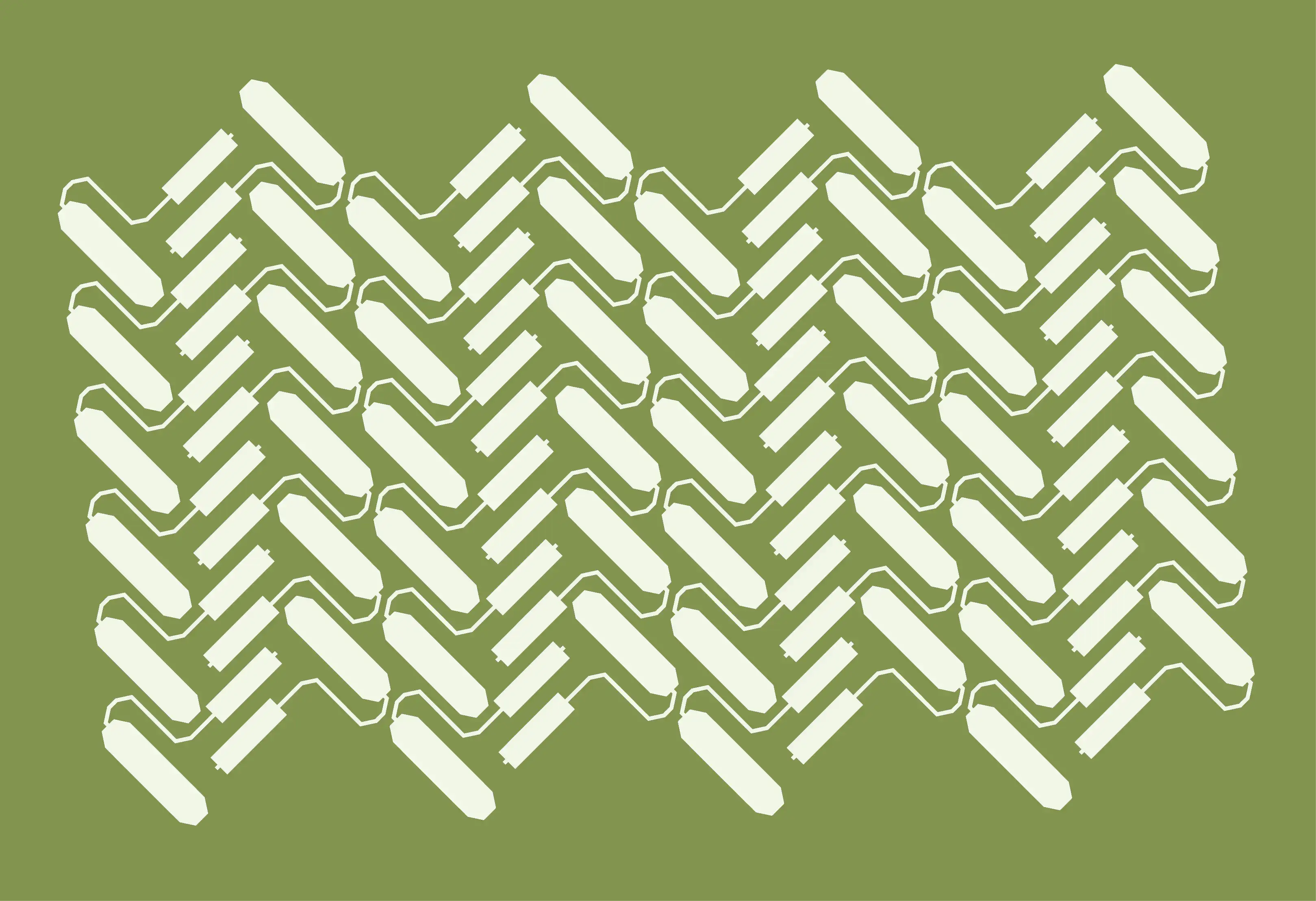
Praxis relies on a heavy geometric typeface with repeating angles found in the letters edges, negtaive space, which mirroed in the angles of the brand's other elements. To stand out on the shelf a color system was developed for the grade or level of the tools and paints used,
To reach the intednded audience, the welcoming colors, repeatring shapes, and readability makes the product's ease of use and friendlyness apparent. Praxis has already don’t the work and practice for the user.

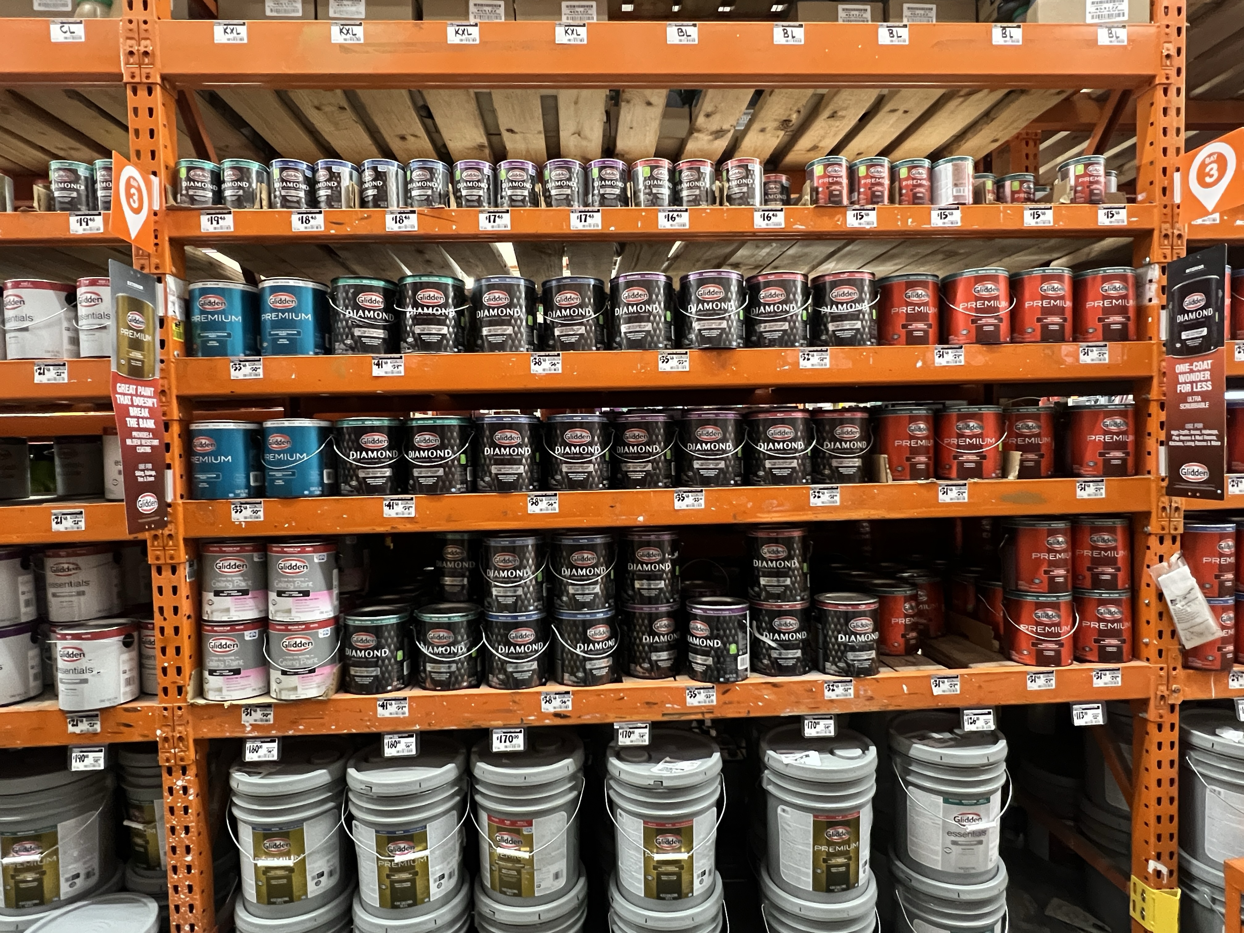
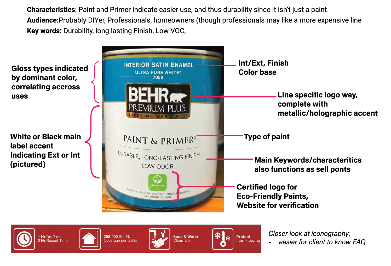
Without a doubt, paint aisles are overhwelming as boring labels loom, it can be hard to make out each brand; drastically reformatted labels depending on quality, shifting logo styles, and information placement. I boiled down the most basic ones, and identified the crucial information to include.


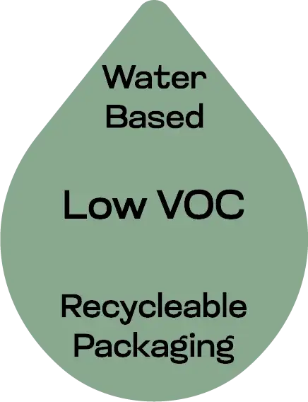

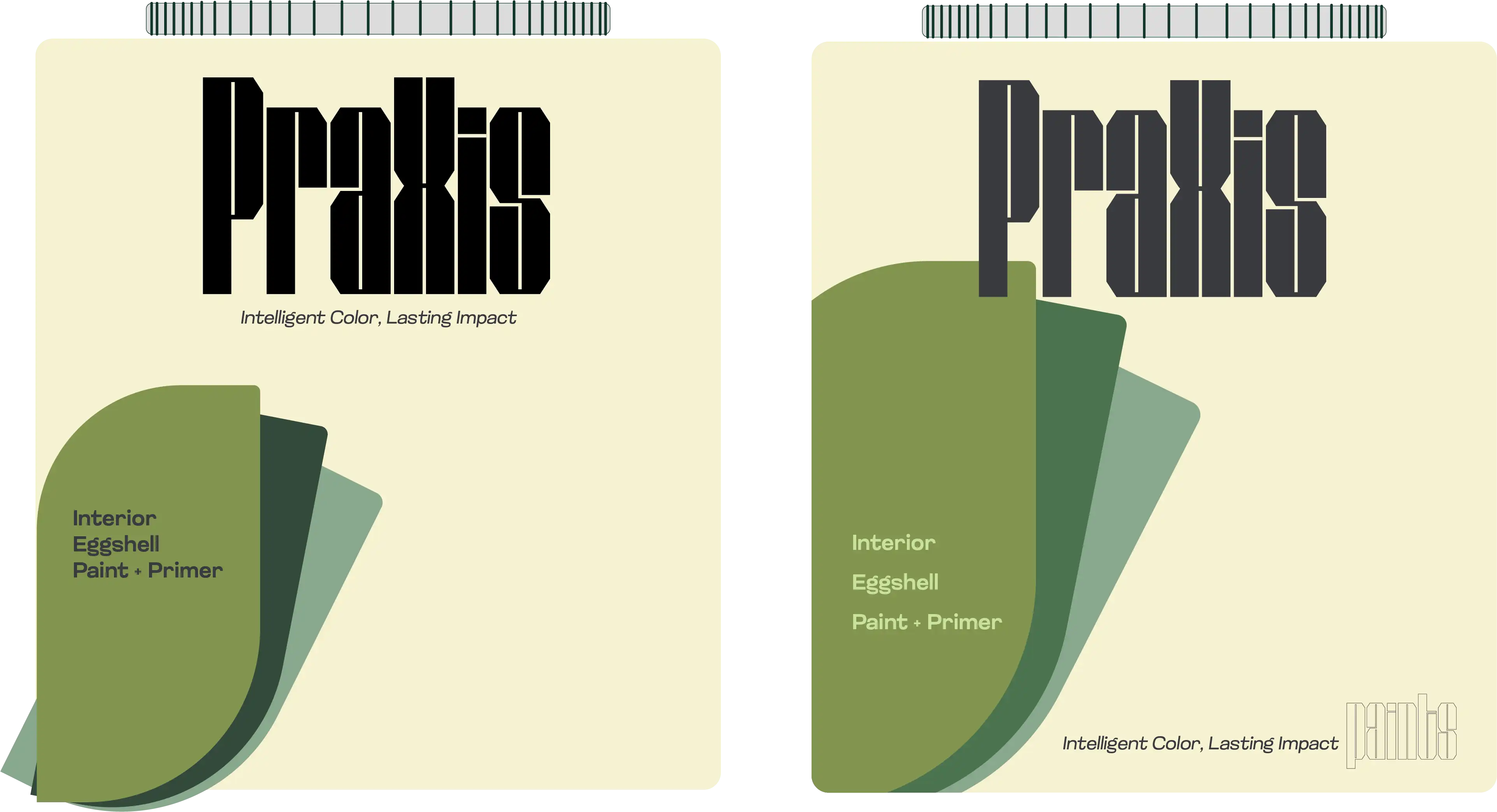
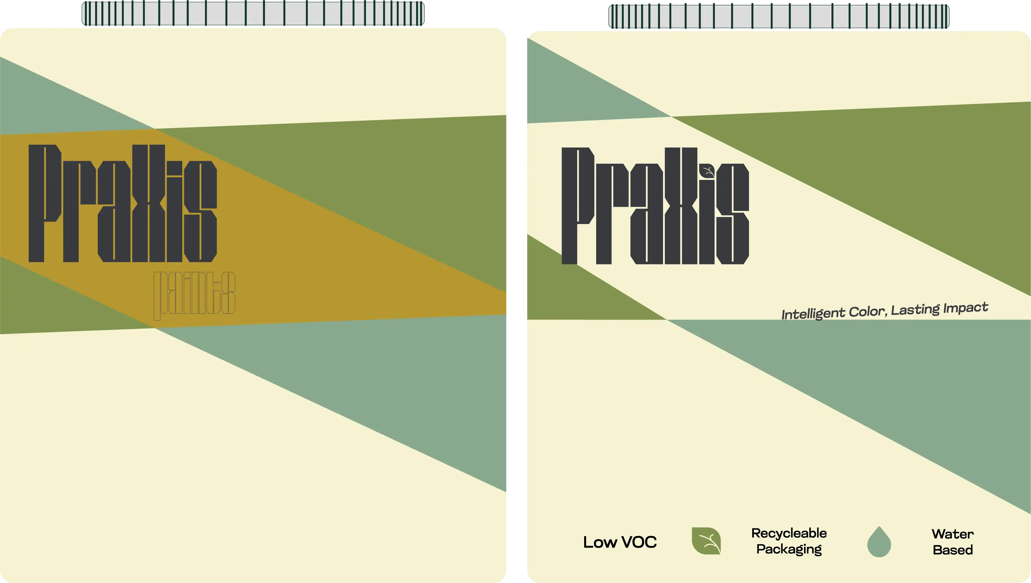

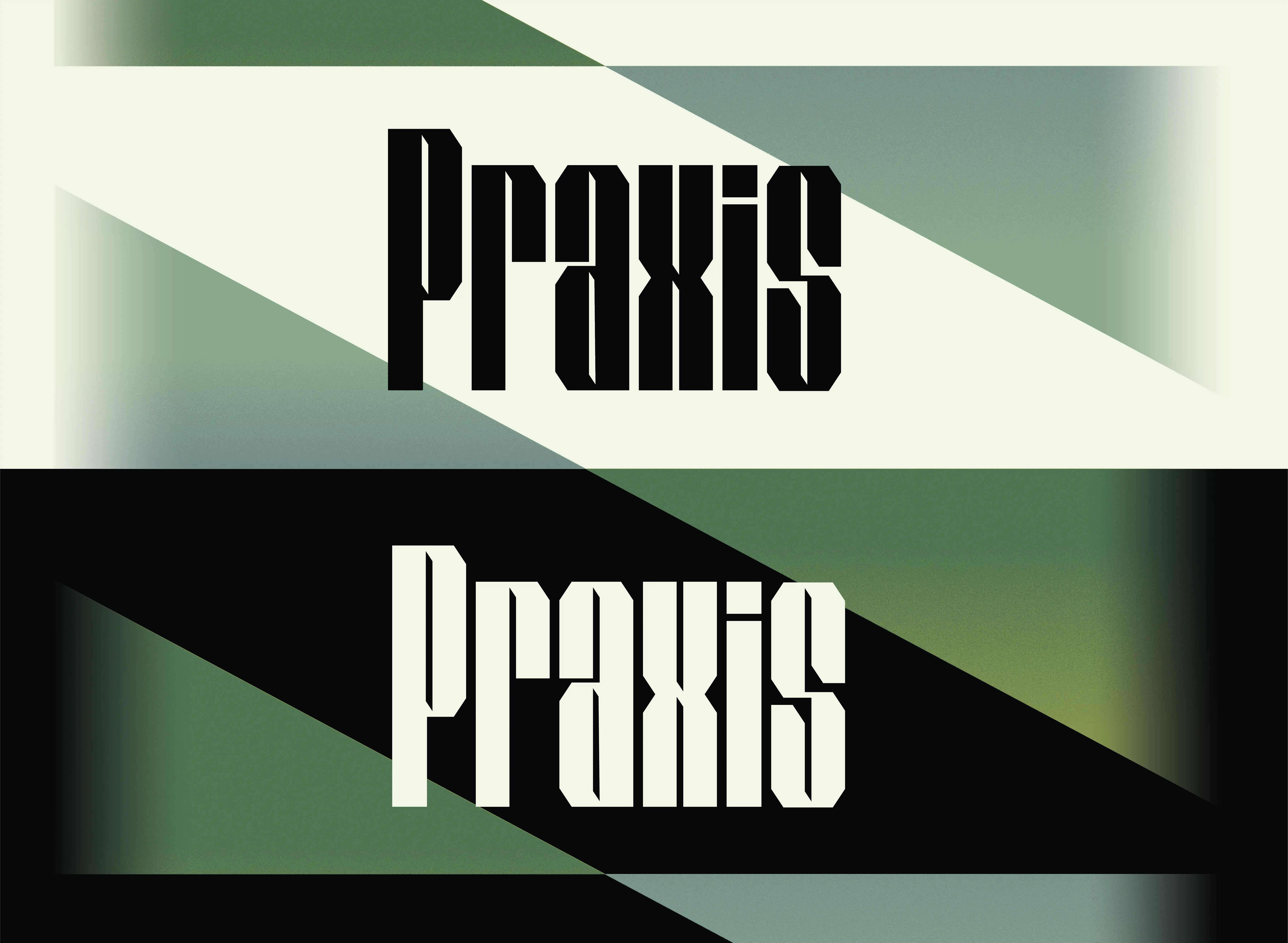
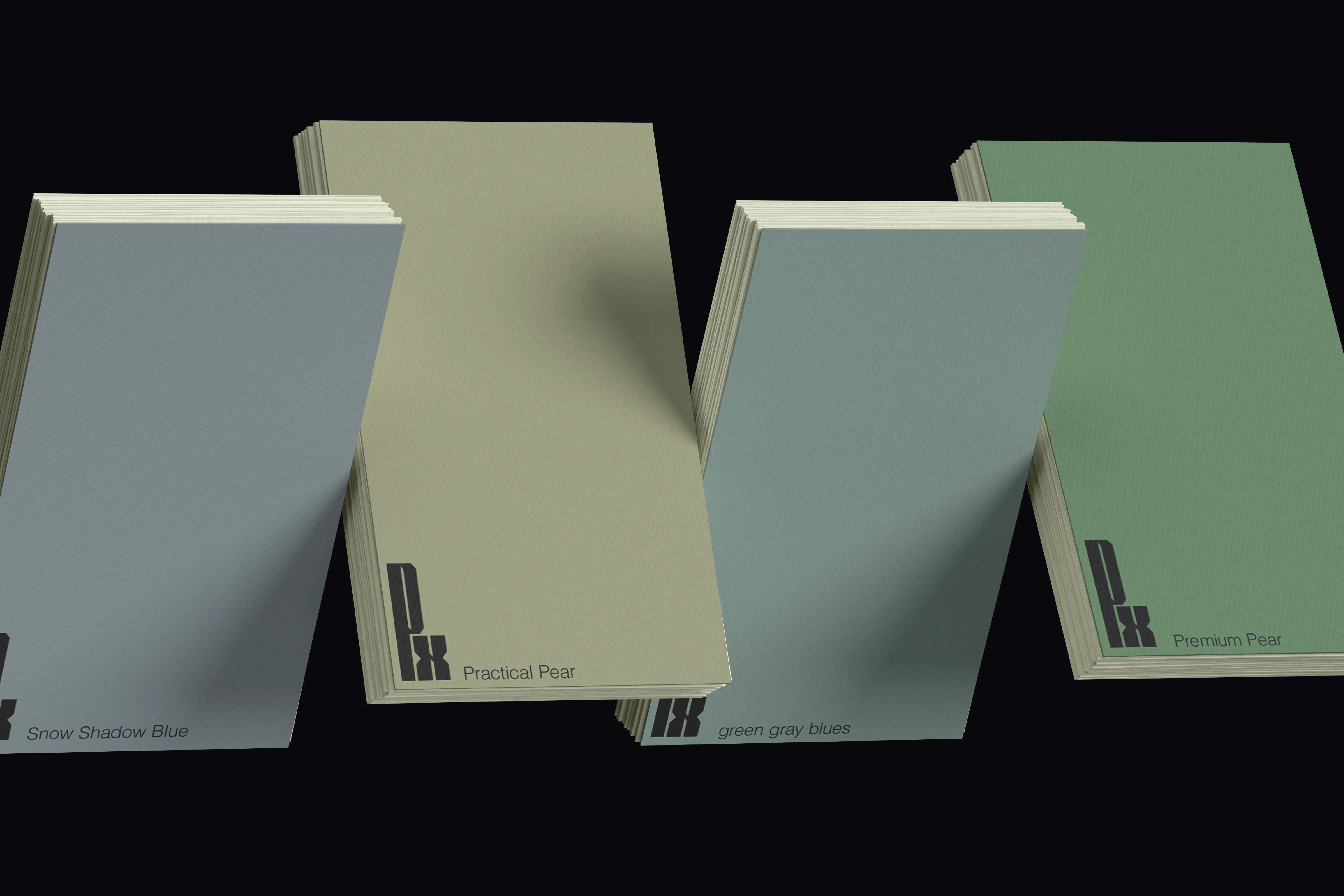
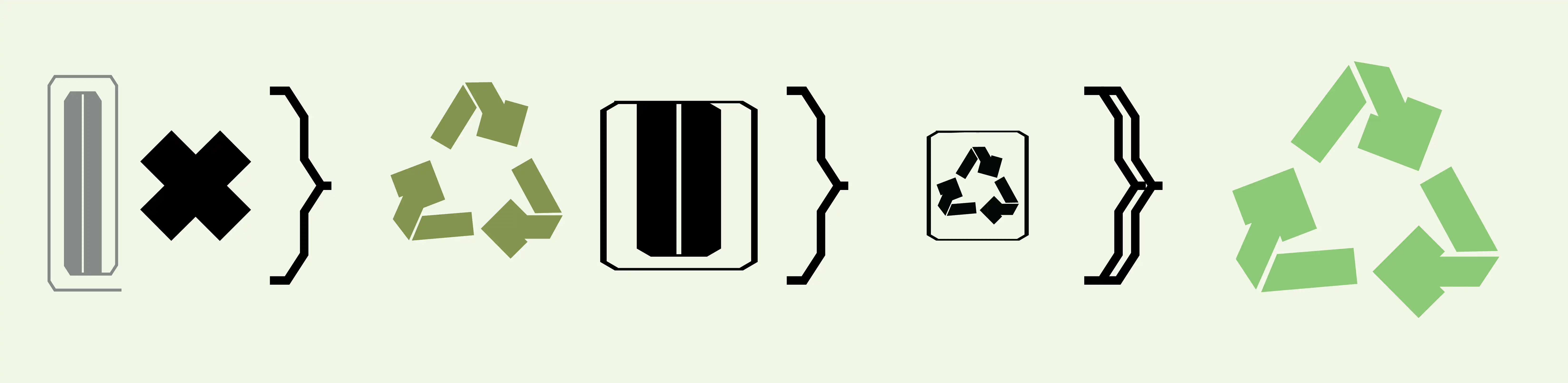


Gravitating towards,type based brand name, with a larger focus on the label, it can stand out from other brands. Colors are natural, light, and maintain the eco vibe. created color system because I wanted classes to differentiate based on grade, but still maintain clarity and be reconizable as a brand.