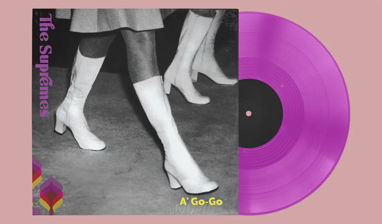
Vinyl "REDO" - The Supremes
[Packaging Design] [Print] [Music] [Animation] [Rebrand]
Challenge
Method
With a physical record of our choice, we set out to redesign the cover, producer label, and overall identity while refreshing the visual system.
Beyond updating the graphics, the work required consideration of the full structure of album packaging including; hierarchy, regulatory body copy, and layout conventions while also producing
a physically assembled record sleeve.
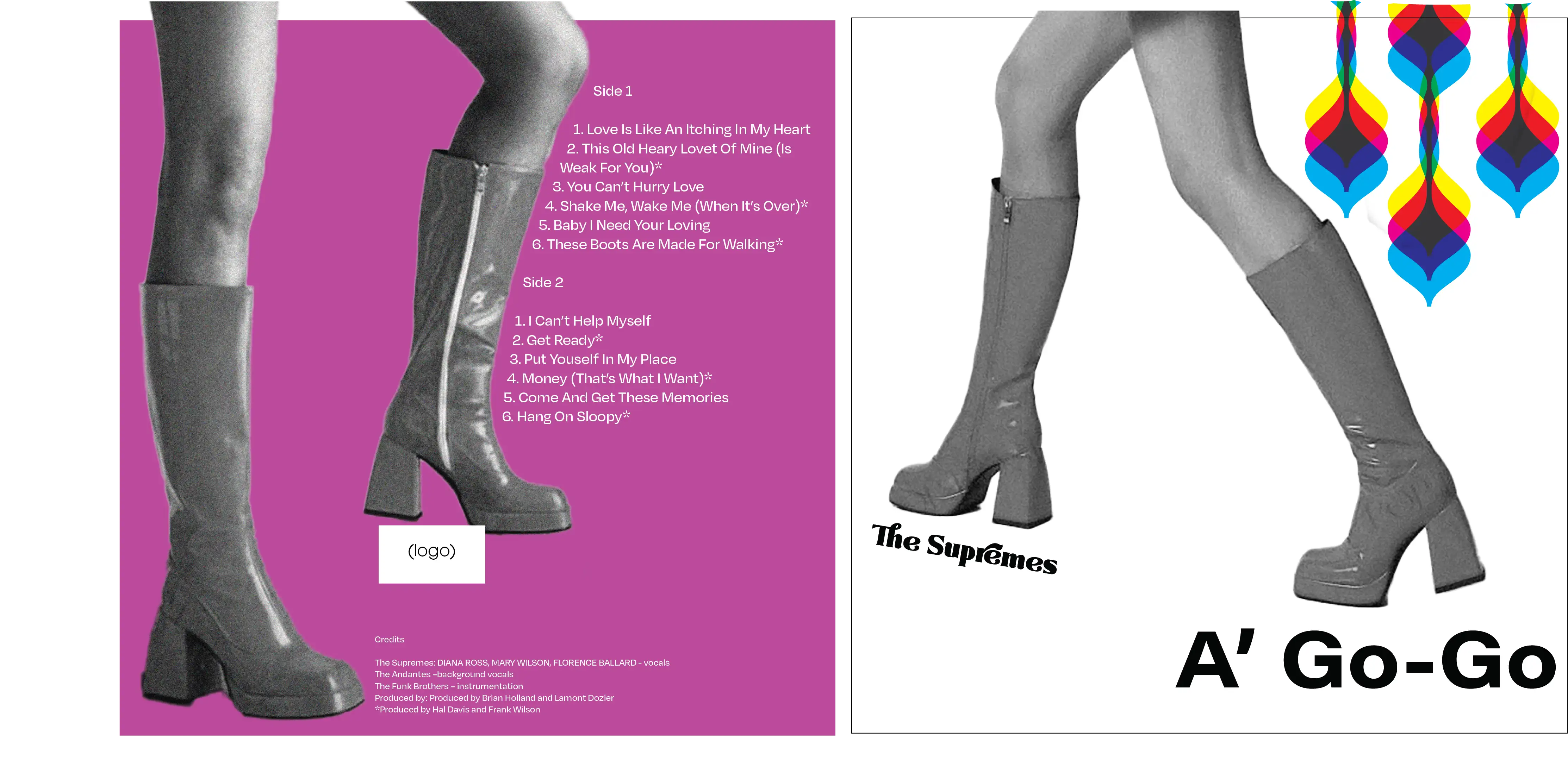
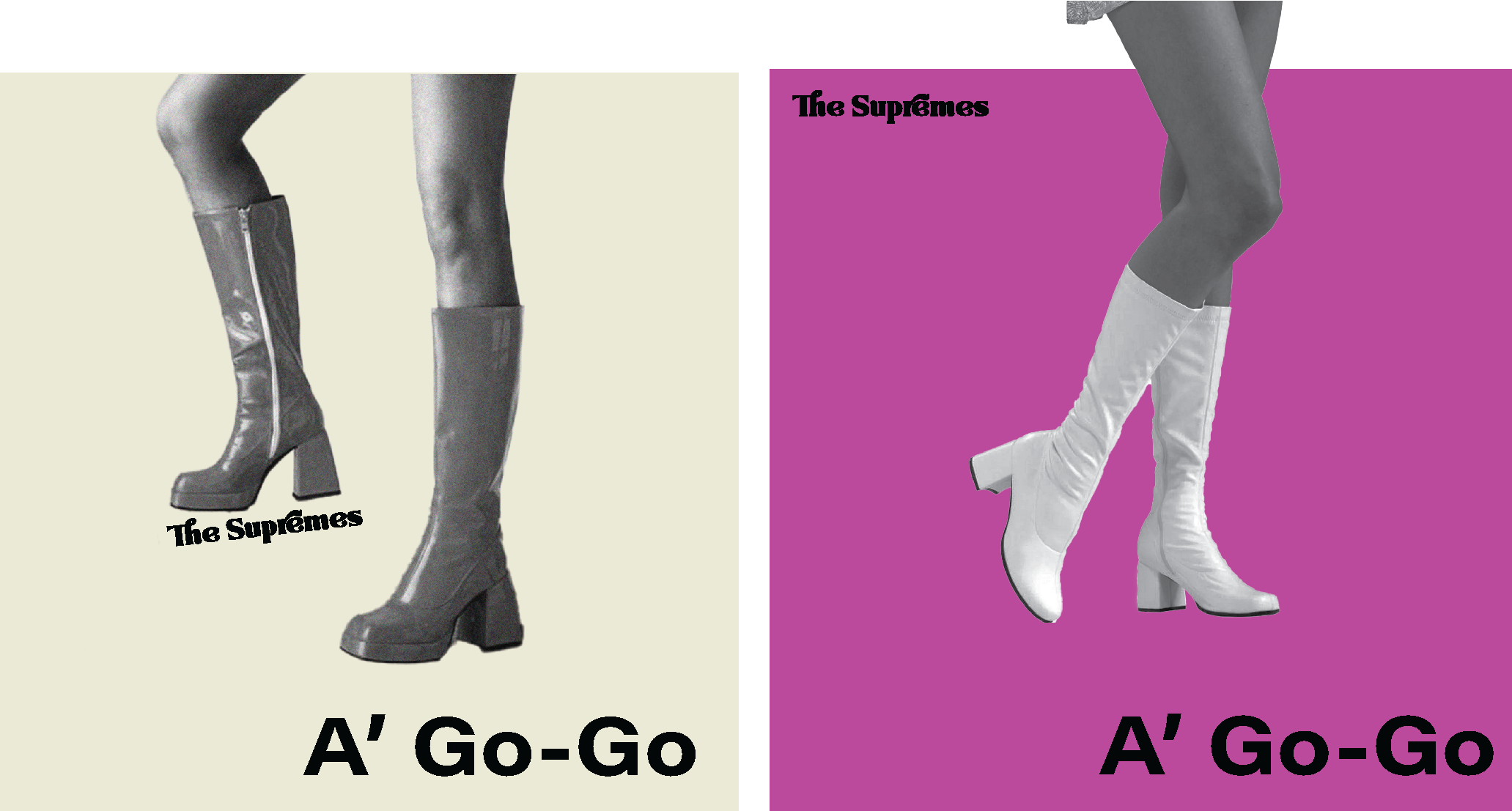
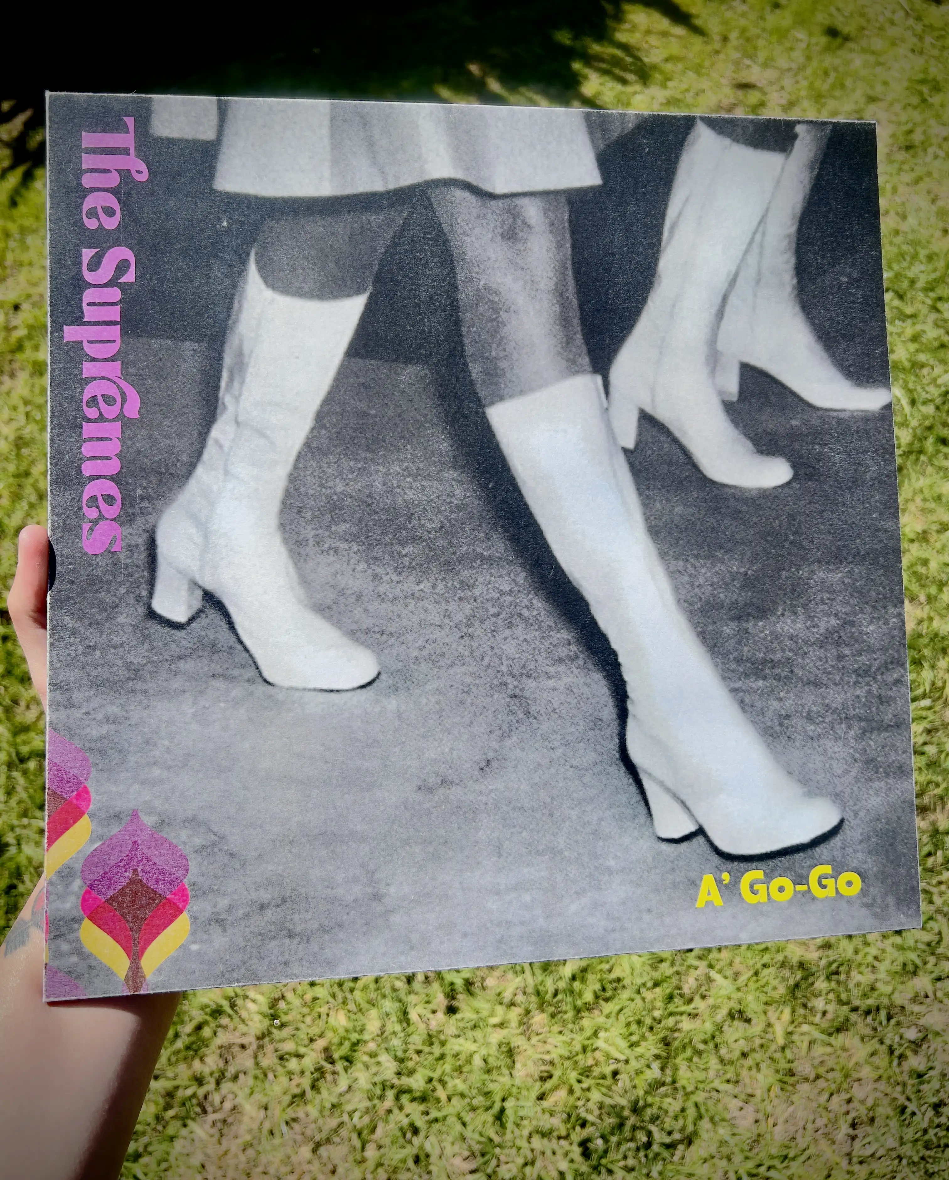
The redesign centers on the confident stride of the boots as the primary motif, using motion and direction to create energy across the composition. Feminine color accents, retro-inspired patterns, and bold typography reference the visual language of the Motown era while contrasting with the grounded texture of the hard stage floor.
The juxtapostion of these with my other textures and elements are meant to produce a sense of strength and femininity while maintaining a contemporary, poster-like clarity that echoes modern music and nightlife graphics.
Research & Explorations
brand:
The Supremes were an American Motown vocal group formed in Detroit in 1959.
The most famous lineup consisted of Diana Ross, Mary Wilson, and Florence Ballard.
- 12 No. 1 singles on the Billboard Hot 100 — the most by any American group in chart history.
- First female group to reach No. 1 on the Billboard Hot 100.Five consecutive No. 1 singles (1964–1965) — tying the record for most consecutive chart-toppers at the time.
- Best-charting female group in Billboard history, with 33 Top 40 hits.
- Most successful act on Motown Records during the 1960s, with the label’s highest number of No. 1 hits.
Moodboard:
Inspired by the
- High saturation
- Patterns,
- Overall vibe,
- Playful
- Powerful
- Yet graceful
Moodboard:
Inspired by the
- High saturation
- Patterns,
- Overall vibe,
- Playful
- Powerful
- Yet graceful

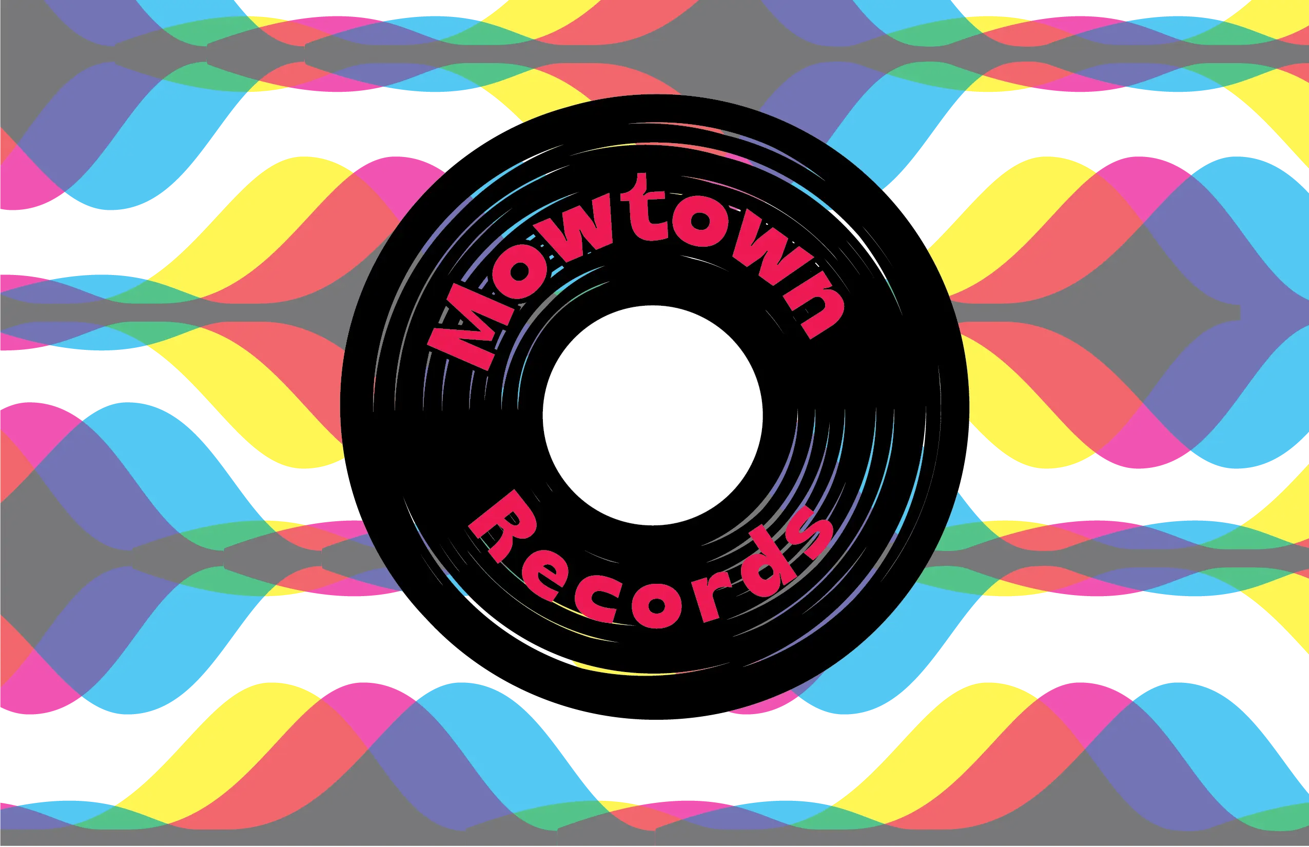
Producer Logo Options 1-3
Option 1

Option 2

Option 1
Option 2
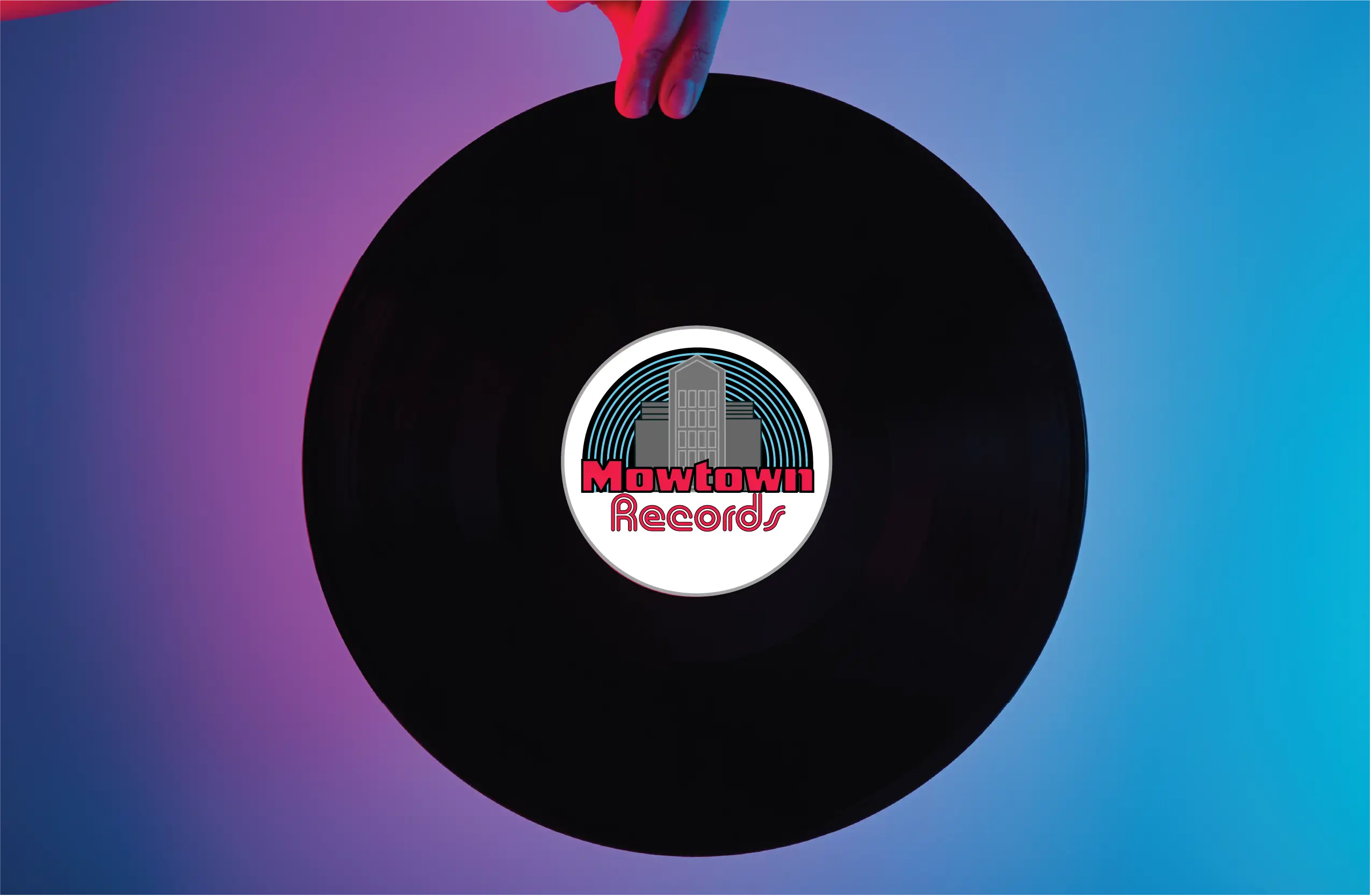
Option 3:
Inspired by city skyline, the simplified buildings here can add dynamic motion. Opting for no embellishments to and a tall, condensed sans serif to really tie in a more modern take on the company's logo.
Album Art Process
The album artwork of The Supremes shows the versatility of Motown-era design. Their covers already explored many visual design styles, but often centered on strong portrait imagery, featuring the trio’s silhouettes or full figures as key elements. This consistent focus on their presence helped establish a recognizable identity while reflecting the graphic trends of the time.

Final Design
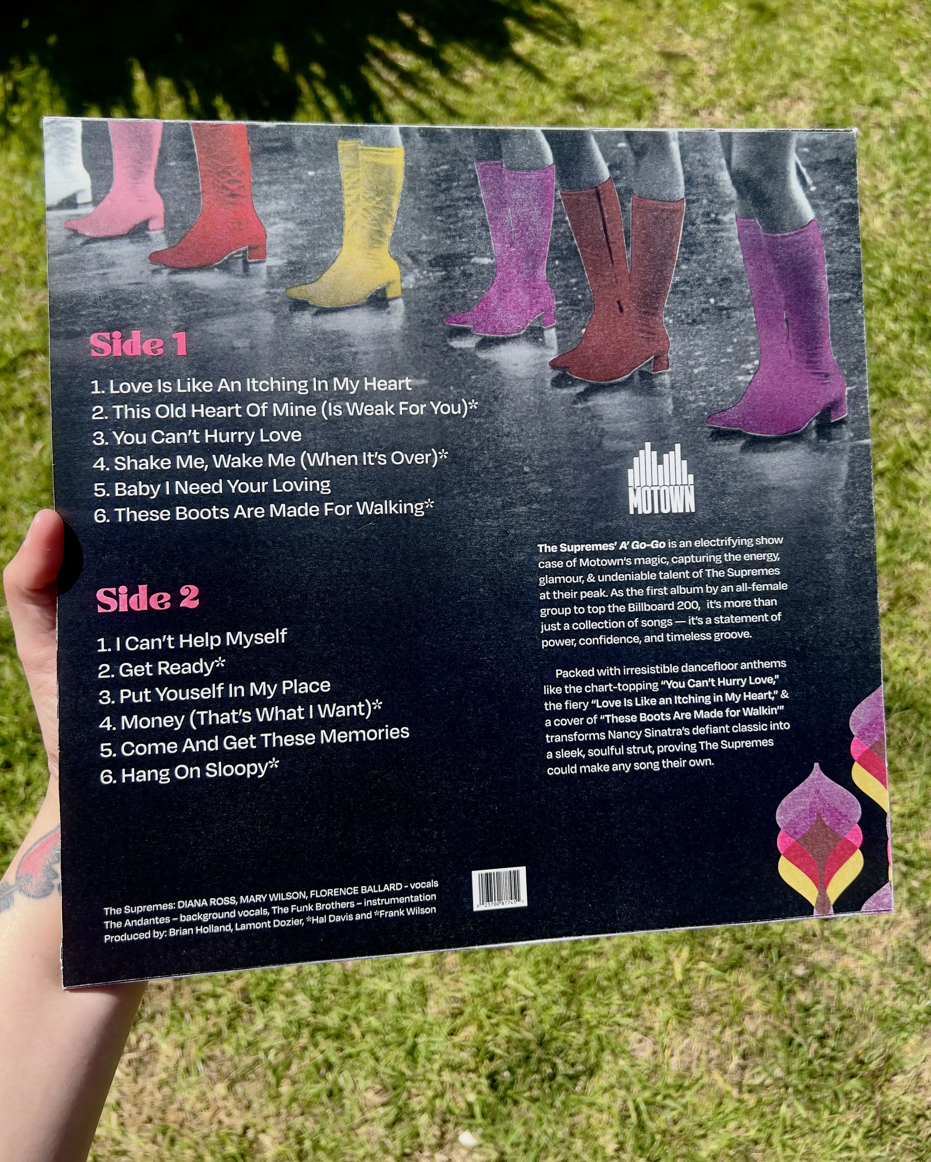
Die line for record folded and assembled. Matte cardstock for a vintage used feel. Boots provide dynamic motion through each frame.Feminine and confident! I layered a trasparent patern to span between both sides of the record, adding to the vintage feel but keeping it modern with its minor placement


.webp)

.webp)